Ideology, PowerPoint, and the Tech Writing Classroom.
The visuals we present our students with or that we ourselves use in technical documents are imbued with political meaning. A picture of a doctor in a medical manual will signify different ideas depending on the gender of the doctor and the cultural beliefs of the audience member. That different cultures view gender differently, however, is not something that should strike the technical writer or the technical writing teacher as a particularly profound fact. The idea that something as simple and seemingly objective as a map or a PowerPoint presentation may be heavily influenced by political ideas of hierarchy, however, may not seem as immediately obvious.
Barton and Barton smartly identify the ways in which maps serve political purposes and function to shape reality through Barthe’s sense of myth. With the particular attention they give to the power in ideology, Barton and Barton note in reference to Roland Barthes ideas of signification and myth, “Barthes (1970) term, naturalizes and universalizes a set of practices so that the phenomenon represented appears to be described rather than constructed (235). It is easy to believe that maps still somehow lie within a more purely objective realm and simply copy or record what is actually there instead of constructing something different than the ways territory is actually divided or the way objects are actually centered.
In preparation for Christmas one year, I found a map at my aunt’s house that showed Earth via the perspective of Australia. Australia was neatly perched on the front and center of the map, which placed the USA in the bottom left corner. It’s only natural for Americans to look at this map and immediately declare the map a joke in which the planet has been flipped upside down, yet this seems to ignore both the actual shape of the planet and some basic laws of physics. If we were to start printing maps this way in the US, we would, as Kuhn would claim, essentially create a paradigm shift in our ideology, not unlike the way Galileo and Copernicus both denaturalized and demystified current notions of centrality.
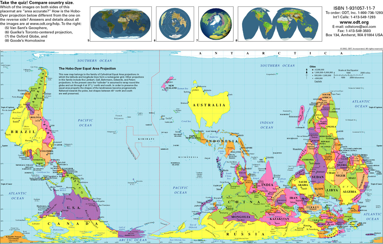
Barton and Barton don’t believe that there is a simple way to avoid biases in maps and think that maps help further propagate Barthe’s ideas of “Myth.” They reference Barthe’s discussion of the Blue Guide that demonstrates bourgeois ideals emphasizing a certain kind of moral discourse (236). Barton and Barton believe the solution to this approach is to be honest about the level of bias in maps instead of trying to ignore or pretend certain political ideals don’t exist. Barton and Barton believe only then will we edge towards any sense of unity in the presentation of maps: “Unity may still be achieved, but it will be a hard-won unity—a unity eschewing the reassuring grand synthesis in favor of the uneasy collocation of competing and rival claims” (249).
One application of this kind of thinking in the tech-writing classroom can address the use of maps overtly like in the example of the Australia worldview above, but this is also relevant to tasks that have map-like writing qualities like PowerPoint presentations. As Tufte rightfully points out, PowerPoint offers its own illogical and frustrating forms of mapping and fragmentation leading to masking “lousy” information (31), though I’m not convinced that Word Processors offer a better solution. Instead, it may help to combine some of the points from Barton and Barton and simultaneously address presentation methods and the need to convey dense information as two separate and equally necessary things. This would result in teaching students how to create a presentation with many slides that integrate images in favor of data accompanied by data-dense handouts that aren’t just a conglomeration of confusing printed slides. Following this method may better meet the goal of Unity in a way which is both better addressing ethics and audience awareness.
Hey Eric,
I’m not really commenting much on the content of your post here, just have a question instead: Have you seen the West Wing episode in which they discuss maps and the ideologies they project? I thought it was a funny episode, and a good way to ease someone into a very basic understanding of what Barton and Barton discuss in depth. Here’s a clip: http://www.youtube.com/watch?v=n8zBC2dvERM
- Will
That’s an awesome clip, Will!
Will, sorry I didn’t reply sooner but I just found this now. That video is fantastic. Thanks for sharing. :)
These are both great teaching tools. Thanks, Eric and Will!