9. Visual Design Practices in Today’s Technical Communication
In their article entitled “Ideology and the Map: Toward a Postmodern Visual Design Practice,” Ben F. Barton and Marthalee S. Barton identify the avenues of ideology within visual significations, specifically in maps, and argue for a strategy of a more inclusionary visual design practice. While they focus specifically on the ideological function of maps, they explain that “visual representations in general are seen as complicit with social-control mechanisms inextricably linked to power and authority” (225). Michael J. Salvo and Paula Rosinski also recognize the ideological function of visual representations when they say, “The process of creating a sitemap—for a traditional text, a digital document, or a virtual space—reminds information designers that their decisions to include and exclude certain information, and the very manner in which they choose to categorize this information itself conveys meaning and value” (115). Unlike Barton and Barton who focus on the map as a semiological rather than a factual system, Salvo and Rosinksi recognize how ideology can operate in digital spaces as well. The recognition that ideology operates within all forms of visual representation, not just maps or digital spaces, made me wonder about familiar visual aesthetics in technical communication today.
Barton and Barton propose a solution for the ideological capacity of visual representations when they say that “what is really needed is a new politics of design, one authorizing heterodoxy—a politics where difference is not excluded or repressed, as before, but valorized” (245). They further explain their ideal scheme of visual design:
Clearly, the governing aesthetic of the visual as collage-palimpsest is not the modernist “less is more” but rather the postmodernist “less is a bore”—an aesthetic that privileges complexity over simplicity and eclecticism over homogeneity, an aesthetic that tends toward the fragmentary and the local, an aesthetic that renounces the driving ambition toward Unity with a capital “U” and “disperses itself among discreet claims and observations.” (248-29)
While I see how a design aesthetic that embraces heterogeneity, complexity , and difference would be ideal, I wonder how much their argument for a postmodern “less is a bore” visual signification aesthetic would catch on in other genres of technical communication. For example, some of the most widely accepted, highly regarded technical documents, IKEA instruction manuals, employ visual representations that erase all difference rather than embracing difference like Barton and Barton propose (see below).
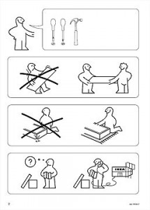
The visual representations in these documents are definitely governed by the modernist “less is more” design scheme that embraces homogeneity and Unity with a capital “U,” a design scheme that has undoubtedly been deemed the most effective way to achieve the documents’ goal by highly skilled technical communicators around the world. I wonder, then, what Barton and Barton would say about IKEA’s particular visual representation aesthetic in terms of their argument on ideology in visual signification.
Works Cited
Barton, B. F., & Barton, M. S. (2004). Ideology and the map: Toward a postmodern visual design practice. In J. Johnson-Eilola & S. A. Selber (Eds.), Central Works in Technical Communication, (pp. 232–252). New York, NY: Oxford University Press.
Salvo, M. J., & Rosinski, P. (2010). Information design: From authoring text to architecting virtual space. In R. Spilka (Ed.), Digital Literacy for Technical Communication: 21st Century Theory and Practice, (pp. 103–127). New York, NY: Routledge.