Textbook Analysis: Technical Communication in the Twenty-First Century

This cover looks better than the second edition's cover, says I.
Technical Communication in the Twenty-First Century, 1st Ed. Cover

Technical Communication in the Twenty-First Century (TCTC) was compiled by Sidney Dobrin, Christopher Keller and Chirstian Weisser. Their book focuses on technical communication through many lenses—they list 10 themes—, but the most ubiquitous themes are rhetoric (used explicitly), the writing process and connections to the work place.

Though the authors do not divide the book such, one could read the book as having four main sections: theoretical grounding, the writing process, types of documents, and an appendix with reference materials. Outside of the appendix, all chapters in every section follow the same format. The chapters begin with a section titled “Real People, Real Writing.” These sections present an interview about writing with a professional writer. The authors cast a wide net for writers, ranging from engineers to marketers to police officers. Chapters are punctuated with activities set off by graphics labeled “Explore,” “Analyze This,” and “In Your Experience.” Further, each chapter ends with overviews of the chapter, multiple case studies (some of which are accessible online, others are on an instructor’s DVD), and writing scenarios that revolve around particular themes such as “collaboration,” “ethics,” or “technology.” A Web site companion to the textbook includes PowerPoint overviews of each lesson, additional activities, and quizzes.

This is the first edition of the textbook. Currently, the textbook is in its second edition. According to the textbook’s accompanying Web site, the second edition added a chapter entitled “Technical Communication in a Transnational World.” The first edition does not address much about cross-cultural issues. The first edition contained a few strange design choices and what I would guess are design errors. But overall, the textbook seemed as though it would provide a strong grounding for a class. That said, with Amazon stocking only four new copies of the book, my guess is this is not a popular textbook.

Writing Process

TCTC organizes its writing process around what it terms the “Problem Solving Approach.” The approach has five elements: plan, research, draft, revise, distribute. Each element offers tasks (ie, under revise: “Test the usability of the document”) that will help develop the document. The authors are careful to note (and repeat) that the approach is not linear. They construe the process as requiring practice to know when to utilize the different elements of it. That said, the introduction to the process looks hierarchical. And at times in the documents chapters, the textbook runs through the process linearly. At other times, the authors insert a “PSA” graphic next to generalized discussion, which accentuates its nonlinearity. And, in at least one instance, the text explicitly shows how one might move from element to element nonlinearly to complete a task.

Rhetoric and Persuasion

This textbook, unlike others we have seen, addresses rhetoric explicitly. A brief look at the authors’s CVs reveals that each teaches classes in rhetoric or works for a rhetoric department. Chapter two of both editions introduces rhetorical terms and concepts. TCTC uses the rhetorical triangle, couched in workplace terms. The book also describes “exigency” and uses that as a basis for much of the work in the “plan” stage of the PSA. It then connects other elements of the PSA to ideas of audience, author and text. Unstated but present are allusions to the rhetorical cannon: questions for the student to answer about organization stands in for arrangement, questions about distribution media for delivery. While the book doesn’t shy away from rhetorical terminology as other books seem to do, the terms only dominate in chapter two.

Document Design and Visuals

Chapters 7 and 8 of the textbook (chapters 8 and 9 of the latest edition) deal directly with design. Chapter 7 uses the term “visual rhetoric” and defines numerous types of graphics and images, two elements the text terms as distinct. Additionally, the text provides theoretical guidelines for visuals. Chapter 8 introduces what the editors call “elements” and “principles” “document architecture.” These include ideas such as balance and connection along with typography and white space. These two chapters are also quite visual heavy; I would estimate these chapters contain more visuals than text and the authors work to give numerous examples of successful and unsuccessful document designs for the various elements and principles they define.

Style and Tone

TCTC addresses style and tone throughout, both in terms of content and the implications of visuals on style and tone. The critical focus tends to be on using tone as a way to demonstrate professionalism. Both in the appearance and content, the editors provide examples of texts that show appropriate versus inappropriate tones.

Document Genres and Types of Writing

The textbook uses 12 chapters to address genres and types of writings. They begin with documents that nearly everyone will have to write: emails, letters, memos, resumes, cover letters, etc. Then, the editors move to increasingly complex or specialized documents: Websites, formal reports, manuals and so on. Each section has many pictures of examples and each section defines many subordinate types of documents. Additionally, the authors note the variety of ethical and technological issues that might accompany particular documents.

Research and Writing Technologies

In the opening chapters, the authors tend to take a descriptive stance on technologies: this is what is available; this is how you may use it. This leaves something to be desired because the book doesn’t outline specific uses. However, the editors remedy this in the document genres, showing how different technologies may benefit a particular text. Additionally, choosing a technology or medium for distribution figures into the textbook’s “Problem Solving Strategy.”

Ethics

I also wanted to address ethics because the authors thought ethical discussions quite important. Ethics is mentioned twice in the “Problem Solving Approach,” and each specific document chapter has some discussion fo ethics.
The Visual Virtual Space –

Salvo and Rosinski’s article continued a lot of the thoughts I had about last week’s readings and discussion. We as professional communicators are doing more than just using words and putting them on paper and on a website. We are evaluating hierarchies, trying to understand our audience, and utilize rhetoric to best reach the audience to deliver them our desired message. And, according to Salvo and Rosinski, “Effective technical communication has never been simply about writing clearly, but rather, about effectively organizing written communication for future reference and application,” (123).

When I went on a tour at Auburn while considering them as a choice for grad school, I was shown a room completely dedicated to understanding the ways in which people read their computer screens and the choices they make when using websites. It tracked eye movement (where the eyes looked first, how long they lingered on a specific area, etc) and also recorded the choices they made when following links. The students then utilized the information received to write usability reports and to better understand web design and hierarchical choices. As a required course in the curriculum, understanding how users work with a virtual space in order to understand how to design that space was obviously considered to be an important asset to a professional communicator.

If we look at the virtual space like we look at documents that we see everyday, it’s easy to understand how certain layouts, fonts, and spaces work to help define meaning and present to the audience the message we’re trying to portray. Salvo and Rosinski say, “Consider memos, parking tickets, wedding invitations, white papers, and reports for decision making: each of these genres carries part of the message in its visual design and physical presentation. The design indicates a range of possible responses to the text, and defines limits to how readers may choose to receive the text,” (107-108).

Virtual spaces have these same capabilities if we can understand how to utilize them. What we include on a website or leave out says something about our message and what we’re trying to say to our audience. Where we place certain things – under what headings and with what other links also shows how we want our audience to interpret our ideas and guides them through the message we’re trying to portray. And while we might be writing the content for websites and virtual spaces rather than designing them ourselves, it is our jobs as professional communicators to understand the rhetoric of space and classification so that our message may best be understood and to help guide the designers on where to place content as they make the virtual space more graphically/visually stimulating.

9. Visual Design Practices in Today’s Technical Communication

In their article entitled “Ideology and the Map: Toward a Postmodern Visual Design Practice,” Ben F. Barton and Marthalee S. Barton identify the avenues of ideology within visual significations, specifically in maps, and argue for a strategy of a more inclusionary visual design practice.  While they focus specifically on the ideological function of maps, they explain that “visual representations in general are seen as complicit with social-control mechanisms inextricably linked to power and authority” (225).  Michael J. Salvo and Paula Rosinski also recognize the ideological function of visual representations when they say, “The process of creating a sitemap—for a traditional text, a digital document, or a virtual space—reminds information designers that their decisions to include and exclude certain information, and the very manner in which they choose to categorize this information itself conveys meaning and value” (115). Unlike Barton and Barton who focus on the map as a semiological rather than a factual system, Salvo and Rosinksi recognize how ideology can operate in digital spaces as well.  The recognition that ideology operates within all forms of visual representation, not just maps or digital spaces, made me wonder about familiar visual aesthetics in technical communication today.

Barton and Barton propose a solution for the ideological capacity of visual representations when they say that “what is really needed is a new politics of design, one authorizing heterodoxy—a politics where difference is not excluded or repressed, as before, but valorized” (245).  They further explain their ideal scheme of visual design:

Clearly, the governing aesthetic of the visual as collage-palimpsest is not the modernist “less is more” but rather the postmodernist “less is a bore”—an aesthetic that privileges complexity over simplicity and eclecticism over homogeneity, an aesthetic that tends toward the fragmentary and the local, an aesthetic that renounces the driving ambition toward Unity with a capital “U” and “disperses itself among discreet claims and observations.” (248-29)

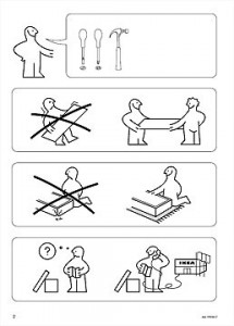
While I see how a design aesthetic that embraces heterogeneity, complexity , and difference would be ideal, I wonder how much their argument for a postmodern “less is a bore” visual signification aesthetic  would catch on in other genres of technical communication.  For example, some of the most widely accepted, highly regarded technical documents, IKEA instruction manuals, employ visual representations that erase all difference rather than embracing difference like Barton and Barton propose (see below).

The visual representations in these documents are definitely governed by the modernist “less is more” design scheme that embraces homogeneity and Unity with a capital “U,” a design scheme that has undoubtedly been deemed the most effective way to achieve the documents’ goal by highly skilled technical communicators around the world.  I wonder, then, what Barton and Barton would say about IKEA’s particular visual representation aesthetic in terms of their argument on ideology in visual signification.

Works Cited

Barton, B. F., & Barton, M. S. (2004). Ideology and the map: Toward a postmodern visual design practice. In J. Johnson-Eilola & S. A. Selber (Eds.), Central Works in Technical Communication, (pp. 232–252). New York, NY: Oxford University Press.

Salvo, M. J., & Rosinski, P. (2010). Information design: From authoring text to architecting virtual space. In R. Spilka (Ed.), Digital Literacy for Technical Communication: 21st Century Theory and Practice, (pp. 103–127). New York, NY: Routledge.

Less is Not More

In the conclusion of their article “Ideology and the Map,” Barton and Barton argue that the alternative design practices they advocate for, collage and palimpsest, draw upon a “less is a bore” aesthetic. They characterize this aesthetic as one “ . . . that privileges complexity over simplicity and eclecticism over homogeneity, an aesthetic that tends toward the fragmentary and the local . . .” (248-249). Tufte echoes this call in “The Cognitive Style of PowerPoint: Pitching Out Corrupts Within.” In a section discussing high-resolution visuals, he writes, “Indeed, quite often, the more intense the detail, the greater the clarity and understanding – because meaning and reasoning are relentlessly contextual. Less is a bore” (15). Less can be a bore – at least as far as content goes.

Both articles seek to articulate the underlying ideologies in everyday genres and in the process demonstrate how design influences our understanding of content. Barton and Barton’s discussion of the London Underground, in particular, called my attention to the rhetorical power of design. The iconic Underground logo, as well as the overall design of the tube map (one which strikes me as “clean” and aesthetically pleasing – much like the design of, say, Apple products) works to promote bourgeois values. Citing Barthes, the authors demonstrate how the London Underground Diagram’s clean design, which does not reflect the “messiness of the actual city,” is “ . . . a dissimulative attempt to engender chauvinism in the viewer” (242). Furthermore, the diagram’s design encourages a kind of capitalist consumption of the city (243). Design is not innocent.

Tufte’s article also focuses on deconstructing a common tool – one that is much more familiar to me as a student and teacher. I am not often tasked with designing maps (or at least not ones that will be seen by anyone but myself), but I have made my fair share of PowerPoint presentations. In a scathing critique, Tufte points to the inadequacies of PowerPoint intrinsic in the software itself. For example, PowerPoint templates allow users to easily create lists and bulleted points. As Tufte notes, “too often the speaker is making power points with hierarchical bullets to passive followers.” He goes on to link this structure to hegemonic systems (7).

As I read through Tufte’s article, I couldn’t help but notice how much of what Tufte critiques is similar to the practices outlined in the textbook I use in ENGL 305. Over and over again, the textbook stresses creating hierarchical lists and bulleted points (as long as they fit into generic conventions). Creating lists is described as a way to make the text more user-friendly.

In the case of power points, Tufte argues that lists do not allow for the deep contemplation of information necessary for serious reports. In his review of NASA slides, he asks, “How it is that each elaborate architecture of thought always fits exactly on one slide?” (12). In reality, it doesn’t, but PowerPoint dictates that we present information that way.

In other genres, of course, hierarchical lists and bulleted points are effective ways to present information. However, I wonder how much the cognitive style of PowerPoint has infected my students’ and, I worry, my own writing. Although the textbook stresses that content comes first, just like in a power point, however, it is easy for us to create visually pleasing documents in Microsoft Word, for example, that lack actual content. The received wisdom in the technical writing textbook I employ seems far too close to the practices that lead to the kind of sloppy thinking PowerPoint promotes.

The solution? Both Barton and Barton and Tufte argue for more content – again, we see that “less is a bore.” In many ways, Tufte’s article can be read as an ethics of PowerPoint. The underlying ideology in the software itself, which he characterizes as “a smirky commercialism that turns information into a sales pitch and presenters into marketeers” (4), promotes sloppy thinking. Like Barton and Barton, Tufte promotes an alternative – in this case, Microsoft Word or other word processing software to create print documents. However, PowerPoint is relatively easy to use and ubiquitous. It is the primary software for creating slide presentations, whether the content is “serious” or not (although I’m no longer convinced it should be used if the content is less serious, either). Because PowerPoint is so firmly entrenched in academic and business culture, we should focus our efforts on creating better presentations. Christina’s post is a great resource.

Works Cited

Barton, B. F., & Barton, M. S. (2004). Ideology and the map: Toward a postmodern visual design practice. In J. Johnson-Eilola & S. A. Selber (Eds.), Central Works in Technical Communication, (pp. 232–252). New York, NY: Oxford University Press.

Tufte, E.R. (2006). The cognitive style of PowerPoint: Pitching out corrupts within (2nd ed.). Cheshire, CT: Graphics Press.

Tufte ignores a hallmark of PowerPoint presentations

Tufte’s article was at once amusing and a bit frustrating for me. Having sat through many PowerPoint presentations that would have made Tufte cringe (little data, unclear use of bullets, use of fragments rather than developed reasoning), I was buying his critique. In particular, the shortcomings of the medium seemed laid bare when Tufte provides a numerical analysis of the data in PowerPoint presentations. Just a hair above Pravda? You have to be kidding me.

At the same time, that statistic gave me pause. The comparison to a Soviet-era propaganda machine seemed over-the-top. And, looking at the other examples made me realize: These are all print examples. And, some of these examples (Nature, Science, New England Journal of Medicine) were rather rigorous and academic. I would argue that comparing PowerPoint to Nature is irrelevant at best and misleading at worst. For Tufte is ignoring two central elements to PowerPoint presentations: the speaker and what the speaker says.

At the outset, we can see some odd linguistic tricks Tufte uses to make his argument. In the second paragraph, Tufte writes: “this chapter provides evidence that compares PowerPoint with alternative methods of presenting information” (3). The emphasis is in the original, but let’s compare it to what Tufte has to say in the following paragraph: “The evidence indicates that PowerPoint, compared to other common presentation tools, reduces the analytical quality of serious presentations of evidence.” Tufte seems to be waffling between “presentation of information” and “presentation.” The former term seems quite generalized; the latter, in my understanding (and I’d guess I’m not alone), generally refers specifically to in-person, oral, speech-like information.

And here, of course, is the problem. Comparing Nature (or the New York Times, or emails (12), or technical reports (13)) to PowerPoint is a false equivalency. You will not be able to deliver the same sort of information through PowerPoint that you would through a technical paper.

And, in some instances, this seems to be Tufte’s point. For some situations, a technical report or an email conversation or a journal article from Nature is the correct medium. And, when dealing with critical technical issues such as whether a shuttle is flight-worthy, these more data-rich methods are probably the right media.

Sometimes, though, we need information delivered to a diverse audience, in person, and orally. And I don’t know whether we should throw out PowerPoint in these situations. Sure, many of Tufte’s critiques hold true. And his analysis of the structure behind PowerPoint itself is one I am sympathetic to. But, without an analysis of what is being said versus what is being shown on the screen, I don’t know how valuable this critique is. For instance, Tufte praises special parallelism. And certainly PowerPoint should take advantage of this. But, by leaving out what was (or was not) spoken during the presentation, we have no way of knowing whether presenters are creating other types of parallelism that might overcome some of the downfalls of individual slides.

Moreover, as we’ve seen in class, many of the best presenters create a synergy between the oral part of the presentation and the PowerPoint. Measuring either alone does not paint the full picture. Therefore, even some of Tufte’s suggestions are less impactful. What point is there in reimagining our slides if we have not considered yet how those slides interact with our speech.

Tufte claims to have amassed an “unbiased collection of 2,000 PP slides,” but I disagree. In choosing only to look at the text, Tufte has revealed himself as biased toward long-form, written material. A more thorough analysis of the effectiveness (or ineffectiveness—I’m no convert!) of PowerPoint would require looking at the full presentations, not simply the disembodied slides.

Reading Response: Design of Maps

I found Barton & Barton’s “Ideology of the Map” particularly interesting mostly because it has been a long time since I considered the political-ness of the map, or even thought about maps at all; or to connect these thoughts along any of the lines leading to professional or technical writing.

To me, a map was just something that I sometimes looked on Google for, or browsed or bought at a rest stop driving through a state; something charted and printed to help me get somewhere I needed to go. I did not, however, consciously consider the authority that that map holds; the power and the trust that I give it. Thinking further, with the aid of explications from Barton and Barton, one becomes aware of a certain scientific-ness about the map. There is a strong analysis possible within the different parts. Cartography is not quite an art, not quire a geography, not quite archaeology, not quite science. However, the making of a map can be a very technical thing and as this paper suggests, imparts upon the cartographer many choices, both implicit and explicit. The broadest of these “choices” being whatever social, economic, and cultural influences are being made for the creation of the map.

Barton and Barton bring up many specific examples of these influential factors, but I can see it all revolves around ones awareness of the self and the other, and an overall awareness of the social economic, and cultural influences when a map is being viewed or created. Where is the power being exerted?

“This ‘omphalos syndrome’ where a people believe themselves to be divinely appointed to the centre of the universe, can be traced in maps widely separated in time and space.” (237) Where we, this inclusive “we”, draw maps where “our” country, or our primary city is at the central point. The center is the focal point; it speaks of dominance and importance.

I also found some details explicated within the section titled “Repression of the Act of Production” particularly interesting. The beginning of this section described how maps had progressed from the first medieval maps, which focused on itineraries, distances caluculated by walking time, and important cities at which to stop, to the maps created by the 17th Century which “colonized space”. An important aspect of maps and the political nature of them is for what purpose they were created. The type of map in medieval time frames was (of course) connected to the main life focus at the time. This included pilgrimages and other important journeys to be made on foot. There was a slot less long-distance travel and when maps were needed and long distance was expected, it was much more serious than it is today.

Connections:

To tie in these concepts with some topics previously discussed in this class, we can make the connection to the professional and technical writer. If we consider the cartographer as a professional, or more pointedly, a technical writer, “writing” directions or instructions to the land, then we must question his identity. Is her merely a channel through which the land is explained? Does he merely translate, draw out, and label what is described to him? Or is he a key factor, a key contributor to the shape, the culture, and the implications of the map? Barton & Barton might argue for the latter with the cast conceptions that influences the map.

Barton B.B. & Barton M.S. (1993). Ideology and the map: Toward a postmodern visual design practice. In J. Johnson-Eilola and S.A. Selber (Eds.), Central works in technical communication (pp. 232-252). New York, NY: Oxford University Press, 2004.

Digital and Print Versions of Postmodern Design Practice

Barton and Barton’s “Ideology and the Map: Toward a Postmodern Visual Design Practice” struck me as being particularly relevant in light of the digital revolution. Barton and Barton write that ideology and power are expressed in mapping practices, and that these phenomena are represented as being described rather than constructed. Barton and Barton (1993) refer to this process – the process of masking the act of construction behind mapping practices – as naturalization (p. 235). The authors argue that naturalization is harmful, as it works to reinforce the dominant class structure and to repress the Other.

In an attempt to fight against the effects of naturalization, Barton and Barton (1993) offer examples of ways to avoid presenting reality as a unified whole. These examples include presenting spatial information in a collage format and temporal information as palimpsest (p. 245).

One example of “denaturalize[ing] the natural” (p. 235) that Barton and Barton (1993) give is “the lighted board map in several Parisian Metro stations, whereby the viewer can override the totalizing effect of the map by registering her destination and receiving an individualized, highlighted itinerary” (p. 248). This particular technique seems to be well-fitted for the digital sphere, where space is much more abundant than print space.

In fact, Google offers a mapping overlay service, which allows users the chance to individualize their Google maps. Google specifically offers:

  • Google Picasa (used to place personal photos on Google maps)
  • My Places (used to draw personalized maps)
  • Data in Tables (used to draw maps based on data imported into Google Fusion Tables)
  • GPS Tracks (used to convert and store GPS files onto your computer)

Google also allows users to upload their own versions of maps and to overlay information on these maps with its Map Maker service.

This service is certainly similar to the highlighted itinerary offered by the Parisian Metro stations mentioned in Barton and Barton’s paper. Map Builder also offers similar services. The digital medium, then, seems to offer rich potential for postmodern explorations of representation.

What the paper did not discuss as thoroughly, however, was how postmodern concepts of design could be applied to print texts. (To be fair, the paper claims to address visual design, not print-based text design. I found the topic interesting, nevertheless.)

The paper does offer a few simple guidelines for writing centered on denaturalizing the natural. For instance, according to Barton and Barton, authors should not mask the fact that their writing is an act of production. Writers should also include long block quotes, rather than simply summarizing important information, in order to include the Other (in this case, the other author). Finally, writers should include as many footnotes and marginalia as are needed, and avoid representing reality as a fixed entity (Barton and Barton, 1993, p. 239).

Yet it seems more difficult to implement postmodern concepts into writing than it does to implement postmodern concepts into visual design. This stems from the fact that writing is primarily linear, and linear entities are, by their nature, ordered.

As Barton and Barton (1993) remind us, “Privileging is also effected in a series through ordering, where the first, and to a lesser extent, the last, elements gain distinction” (p. 237). In writing, then, certain things topics are going to be highlighted just because they appear before others. For instance, even in Barton and Barton’s paper, which employs some of the postmodern techniques that the authors list, information is presented in a hierarchal order. The section on “rules of inclusion,” for example, is privileged over the section on “rules of exclusion” because the former appears before the latter.


Barton B.B. & Barton M.S. (1993). Ideology and the map: Toward a postmodern visual design practice. In J. Johnson-Eilola and S.A. Selber (Eds.), Central works in technical communication (pp. 232-252). New York, NY: Oxford University Press, 2004.

9: With Digital Technology Comes Great(er) Responsibility

Something that seems to be coming up again and again in our readings is that technical communicators are “not just” anything. They are not just the transmitters of information. They are articulators. They are not just users of technology. They are digital literates who “apply…the thoughtful deployment of technologies” (Salvo & Rosinski, 2010, p. 123). Technical communicators are becoming—or perhaps, have always been—complex people. Their jobs in the multitude of industries and positions in which they find themselves have demanded complex intelligence and thoughtfulness. If nothing else, this is the one thing I will walk away with at the end of this semester—I’m convinced—technical communicators are “not just” boring, formula-following writers who don’t do anything but regurgitate information. They are a key element to the development, production, and transmission of information. As Salvo and Rosinski (2010) describe through Churchill’s words—”We shape our buildings, and afterwards our buildings shape us”—technical communicators have to be able to determine how their documents and productions, digital or otherwise, will be used, how users will interact with the text or software (p. 124). It’s not important, necessarily, that technical communicators are trained in every design technique, for example, but it is important that technical communicators have, at the very least, an understanding of “the language and concerns of information designers” (Salvo & Rosinski, 2010, p. 125).

As we continue our consideration of visual elements, design, and influence, I realize how little I’ve either A) paid attention to such discussions in past undergraduate and grad-level courses, or B) how little exposure I’ve actually had to such discussions. To constantly keep in mind the effectiveness of visual elements in the development of a text or document is something that seems obviously necessary, and yet, is something I, personally, fail to consider as frequently or thoroughly as I should. What scholars like Kumpf (2000) are doing is exactly what needs to be done: bringing to lightall of the elements any writer or developer of a text should have in their back pocket, from writing skills to knowing how to effectively use the plethora of computer software features now available (p. 402). Kumpf actually provides, at one point, a very simple explanation I’m not sure I had arrived at myself about why there seems to be such a sudden surge of support for visual communication, as we saw in last week’s readings. He (2000) says: “Twenty years ago, most technical writing classes acknowledged visuals, but those visuals were secondary to text. Moreover, most students then could not import visuals into the text, but rather saved them in an appendix” (p. 403). I guess this seems obvious now, but of course visuals would apparently be seen as thrust upon a pedestal—our channels and mediums for communication have gone visual in this digital era. So written communication is not lesser in any way, visuals are just becoming supplementary in their importance in digital and other documents and texts.

I thought in Barton and Barton’s (1993) discussion of the map as visual representation and the rules of inclusion and exclusion was an incredibly important perspective to consider. As we continue to move headlong into an increasingly visual era, I think, as with maps, viewers and users of digital technologies and texts have to be fully aware of what the visual elements are meant to be representing, what the visual elements appear to be representing, and what the visual elements are not (or are not able to) representing (p. 238–39). It is, thus, equally as important for technical communicators and information designers to always be conscious of their choices—making informed choices and being careful of what visuals they choose, or don’t choose, to represent the information they are transferring. Finally, in Barton and Barton’s (1993) closing thoughts, they say “the governing aesthetic of the visual as collage-palimpsest is not the modernist ‘less is more’ but rather the postmodernist ‘less is a bore’—an aesthetic that privileges complexity over simplicity and eclecticism over homogeneity…” (p. 248). In juxtaposition to last week’s readings, particularly Lauer and Sanchez’s discussion of visuospatial thinking, Barton and Barton’s description of the modernist “less is a bore” aesthetic is surprising. Maybe in 1993 this would have still been the preferred aesthetic, the complex over the simple, the eclectic over homogeneous, but it seems we’ve moved into more a “less is more” aesthetic where visual designs that are simpler are arguably clearer, more effective, and more visually appealing—and this could arguably be a result of our society’s need for expediency, anymore, which is a direct result of digital technology. As we are able to find information more quickly, we need the visuals around us to “speak to us” quickly, and visuals that are not complex and eclectic, butare simple and homogeneous, tend to grab our attention and keep it for the necessary seconds it takes for us to internalize the information. Of course, simple and homogeneous does not mean not aesthetically pleasing. With the surge in visual thinking, we need information quickly but it still has to look good enough to interest us.

Barton, B. F., & Barton, M. S. (1993). Ideology and the map: Toward a postmodern visual design practice. In J. Johnson-Eilola & S. A. Selber (Eds.), Central Works in Technical Communication, (pp. 232–252). New York, NY: Oxford University Press, 2004.

Kumpf, E. P. (2000). “Visual metadiscourse: Designing the considerate text.” Technical Communication Quarterly, 9(4), pp. 401–424.

Salvo, M. J., & Rosinski, P. (2010). Information design: From authoring text to architecting virtual space. In R. Spilka (Ed.), Digital Literacy for Technical Communication: 21st Century Theory and Practice, (pp. 103–127). New York, NY: Routledge.

Textbook Analysis: John M. Lannon’s Technical Communication (9th Ed.)

The cover of Technical Communication (9th Ed.) by John M. Lannon

Introduction

The ninth edition of John M. Lannon’s Technical Communication particularly focuses on the social aspects of technical communication, and emphasizes the importance of audience awareness, ethical considerations, and understanding the contexts of workplaces. The textbook’s preface lists several changes from the eighth edition, including:

  • Updated chapters on Web design, document design, and usability that “reflect changes in the technology”
  • Added exercises focused on service-learning
  • Expanded chapter on collaboration
  • Increased coverage of information literacy and critical thinking throughout Part II
  • More comprehensive look at ethical and legal issues, and an increased attention to international and global workplace issues (p. xix-xx).

The textbook is divided into six different parts:

  1. Communicating in the Workplace
  2. The Research Process
  3. Structural and Style Elements
  4. Visual, Design, and Usability Elements
  5. Specific Documents and Applications
  6. A Brief Handbook with Additional Sample Documents (p. v-vi).

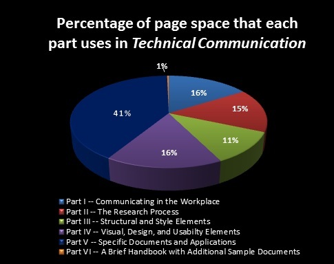
The percentage of page space that each part uses in Lannon’s Technical Communication. Part IV, “Visual, Design, and Usability Elements,” was the longest section of the textbook.

Writing process

Writing is very much defined as a process in Technical Communication. Lannon breaks down writing into five stages: “gather[ing] and evaluat[ing] ideas and information, plan[ning] the document, draft[ing] the document, and revis[ing] the document” (p. 18). Lannon writes that, “Each of these stages are enriched by creative and critical thinking,” and insists that these stages aren’t completely linear: “No one stage of the writing process is complete until all stages are complete” (p. 19). Thus writing, in Lannon’s view, is a recursive process.

Rhetoric and persuasion

Technical Communication places a great deal of emphasis on audience awareness and the power of persuasion. Chapters 3 and 4, in particular, focus on audience awareness and persuasion.

Chapter 3 lists several types of audiences that technical communicators may encounter, and how to address each audience type effectively. Chapter 3 also offers four pages on topics to consider when writing for a specific audience, including the:

  • Purpose of the document
  • Audience’s technical background
  • Audience’s cultural background
  • Audience’s knowledge of the subject
  • Appropriate details, format, and design
  • Due date and timing (p. 32-35)

Chapter 4, titled “Making a Persuasive Case,” focuses on defining persuasion, outlining the different persuasive goals people may have, and addressing how to write persuasively (p. 39-68).

Style and tone

The entirety of Part III is covers style and tone. Chapter 12, “Organizing for Users,” is concerned with structuring paragraphs and sequencing. Chapter 13, “Revising for Readable Style,” identifies several goals related to tone and style for the ideal document. According to this section, readable documents should be:

  • Clear
  • Concise
  • Fluent
  • Focused on using exact word choice

Readable documents should also use an active tone and avoid personal bias.

Lannon points out in Chapter 1 that: “Technical communication does not seek to entertain, create suspense, or invite differing interpretation . . . it leaves little room for ambiguity . . . Technical communication . . . doesn’t address your feelings, hopes, dreams, and feelings” (p. 3).

Document design

Chapters 15 through 17 cover document design. Chapter 15 specifically addresses page and document design, while Chapter 16 addresses document supplements, and Chapter 17 addresses designing and testing documents for usability. Chapter 15 treats document design as a process that occurs after “tailoring the material for the audience, building a persuasive case, organizing for users’ understanding, honing sentences and word choice, and using visuals. According to the chapter, it is only after these decisions have been made that document design occurs: “Finally, you decide how to present your communication on the page itself, to achieve a specific effect.” Page design is described as “determin[ing] the look of a page (whether hard copy or electronic), the arrangement of words and visuals” (p. 344, emphasis mine).

Document genres and types of writing

Although document genres and types of writing are not specifically addressed until Part V of the textbook, the topic is covered extensively. Seven of the nine chapters in Part V specifically address different document genres. These chapters cover:

  • Memo reports and electronic mail
  • Letters and employment correspondence
  • Web pages and other electronic documents
  • Instructional documents
  • Proposals
  • Analytical reports
  • Oral presentations

Visuals and oral communication

Visual Design, Chapter 14: Brumberger (2007) posits that visual and verbal thinking should be treated as complementary (p. 389). Like Brumberger, Lannon makes the argument that verbal and visual messages should ideally work together to create meaning: “This doesn’t mean that verbal messages have become obsolete. Instead, words integrate with shapes and images to create what design expert Robert Horn calls visual language” (Lannon, 2003, p. 291).

Technical Communication addresses a wide variety of visual genres, including:

  • Tables (numerical and prose tables)
  • Graphs (bar and line graphs)
  • Charts (pie charts, organization charts, flowcharts, Gantt charts, tree charts, and pictograms)
  • Graphic Illustrations (representational, exploded, cutaway, and schematic diagrams, and maps and photographs)

Oral Communication, Chapter 26: This section opens with a section titled, “Avoiding Presentation Pitfalls,” and offers a table to describe things that may go wrong in a presentation, because of the speaker, poor visuals, or the presentation setting. After discussing how to avoid these negatives, the text goes on to describe how to plan a presentation effectively. The textbook approaches this topic through a focus on rhetorical context; the first three sub-sections are titled, “Work from an Explicit Purpose Statement,” “Analyze Your Listeners,” and “Analyze Your Speaking Situation” (p. 639-640).

Research and writing technologies

The textbook emphasizes research methods, devoting Part II (15% of its page space) to the topic. Research is described as “a deliberate form of inquiry, a process of problem solving in which certain procedures follow a recognizable sequence.”

Both the procedural and inquiry stages of the research project are depicted in flowchart form (p. 119).

The textbook does not stress writing technologies nearly as often as it stresses the research process; Chapter 20 is the only chapter to specifically address the topic.


Citations

Brumberger, E.R. (2007). Making the strange familiar: A pedagogical exploration of visual thinking. Journal of Business and Technical Communication. 21(4 ). Retrieved from http://courses.johnmjones.org/ENGL605/wp-content/uploads/2012/05/Brumberger-2007.pdf

Lannon, J.M. (Ed.). (2003). Technical communication (9th ed.). New York, NY: Longman.